Every graying movie franchise needs a great sequel to give it a boost. Think Star Trek and James Bond. Operating systems are no different—especially Microsoft's. After receiving a critical beatdown for Windows 8, what does the company have up its sleeve for Windows 9?
It's too early to call Windows 8 either a success or a failure, but it's never too soon to ask what's next, particularly in connection with a rumored mid-2013 update dubbed “Windows Blue.” Microsoft will have to pull off a tricky balancing act with its next version of Windows: It must satisfy its existing base of users while transitioning from the old desktop paradigm to the new touch-first interface. As matters stands, there's definitely room for improvement.
Microsoft declined to answer questions about how it might build on Windows in the future. So we've done some brainstorming—with the help of a few trusty experts—to imagine potential ways forward.
Kill the desktop

Tom Hobbs, creative director for Seattle-based design consultancy Teague, argues that retaining the desktop in Windows 9 would be a mistake. “I think one of the things they should do is just ditch the whole desktop completely,” Hobbs says. In that case, only the touch-friendly side of Windows, with its walled garden of apps, would remain.
But wouldn’t users—especially those in enterprise environments—stage a revolt? Perhaps, but committing to touch also creates a clear path forward for users and developers, Hobbs says. It’s not unlike Apple’s transition from Mac OS 9 to OS X, an operating system that was incompatible with legacy software in the absence of an emulation layer.
“Of course, there’s going to be some resistance to that," Hobbs said. "There’s going to be some slow uptake, but at the same time, it means that people know where they are. They know where they stand."
The key for Microsoft, Hobbs thinks, is to capitalize on its strengths. That means abandoning the fight to make Windows a consumption product—leaving that field to the Xbox team and to devices like the rumored Xbox Surface—and instead positioning Windows as the best touchscreen OS for business. In this scenario, a Modern-style version of Office for Windows 9 would be a must, of course, but Hobbs can also imagine Microsoft reinventing desktop PC hardware with a focus on touch.
Hobbs came up short on suggestions for what this reimagined desktop would look like, but here’s one idea: Think of a Surface all-in-one PC that you could manipulate from afar with a Kinect-like system. It's not so farfetched.
We're already seeing glimpses of this type of functionality. A firm called Leap Motion is releasing a $70 motion sensor peripheral that's about the size of a pack of gum and can be added to Windows 8 PCs. Leap Motion technology lets you track movements of both your hands (and all ten of your fingers) at 290 frames per second and detect movements as slight as 0.01 millimeter (see the video above). Asus says that it will bundle Leap's hand-gesture technology into a number of high-end laptops in 2013.
Other ways to move beyond the mouse and keyboard in Windows 9 are possible, but success will depend on tight integration of hardware and software. Incidentally, such integration is the kind of thing that Steve Ballmer says Microsoft wants to do.
Keep the desktop for diehards
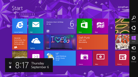
Let’s be honest, though: Killing the desktop in Windows 9 would be an extreme step—and a highly unlikely one. But Microsoft could certainly arrange for a cleaner future transition. The desktop would live on, but in a way that didn’t seem so jarring next to the new Modern-style interface.Raluca Budiu, a senior researcher for user experience research firm Nielsen Norman Group, has an idea about how this might work. Instead of providing a full-blown desktop environment, Microsoft could offer some type of compatibility mode for desktop apps within the Modern-style interface. You would still be able to run the full version of, say, Adobe Photoshop in a self-contained area, with its own windowing system. Meanwhile, another program, such as iTunes, would be confined to its own area. You would lose the ability to run multiple programs side-by-side on a single screen, but none of the other desktop baggage would apply. You'd have no separate Control Panel, no dueling versions of Internet Explorer, no separate file browser, and no taskbar—all features of Windows 8 today.
“Just let PC apps start automatically in this desktop mode...but don’t force people to have to manage their computer by interacting with the two different interfaces,” Budiu wrote in an email exchange. In Budiu's description, the Modern-style interface would take over.
 tmwallpaper.com
So Budiu posits an alternative approach, which amounts to what PC veterans have been requesting all along: Untangle the two interfaces. Don’t send users into the Modern-style interface when they’re working on the desktop. Bring back a pop-up Start menu designed strictly to handle desktop functions and shortcuts. Prevent Modern-style elements such as the recent apps list and the charms bar from popping up along the sides of the screen, where they hinder window management.
“I think that if we really wanted to offer user the flexibility of both PC and tablet in a single device, a stronger separation of the two modes would help,” Budiu wrote.
So what’s the better method? Should Windows 9 do more to separate the desktop and Modern interfaces, or should it further deemphasize the desktop until that interface is no longer needed?
How about doing one and then the other? Untangling the two interfaces could be a minor tweak, so if Microsoft plans to launch a Windows Blue OS this year, improving the Modern-desktop dichotomy might be a great short-term fix. Later, when Microsoft has all of the necessary software and hardware in place to support touchscreen-based computing, it can make a clean break.
Update Modern UI charms

Budiu suggests that Windows 9 could provide visual cues to show what options are hidden in a particular menu bar. Modern-style apps already have plenty of white space at the bottom of the screen, so there’s room to hint (at least) at the contents of the menu bar, using text or partial icons, perhaps.
Another approach would be for Windows 9 to expose the relevant menu controls when a user opens the app, and then slide them out of view after a few seconds—a behavior that iOS apps have widely adopted. “That signals to users that there is something hidden, and it also gives them an idea of what that may be,” Budiu says.
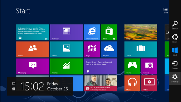
Microsoft might also rethink the charms bar. Currently, app settings are too difficult to access. You must open the charms bar, click settings, and then look for the appropriate settings menu selection in the sidebar—and you don’t know what you'll find there until you look. Moving app-specific settings down to the menu bar would help point users in the right direction, especially if this change were combined with the visual cues that Budiu suggests.
Put apps at center stage

Microsoft can do only so much to spur app development; but according to Michael Cherry, lead analyst at Directions on Microsoft, the company hasn’t done enough.
The biggest problem is that Microsoft hasn’t led by example with great Modern-style apps of its own. Cherry noted that Office served as a role model for desktop application developers, illustrating the usefulness of concepts such as the icon bar and the ribbon interface.

“I have to conclude that developing apps for Windows 8 is hard,” Cherry said, “and the reason I get to that conclusion is...can you name one app from Microsoft that’s good, or full-featured? So if they can’t do it, how does an independent developer stand a chance of doing it well?”
Windows 9 will also have to combine the Windows Phone and Windows ecosystems. Doing so would mean less work for developers (though porting from one platform to the other is fairly easy, says Microsoft), and it would signal to consumers that Microsoft was offering a greater ecosystem worth investing in.
(See related: Why Microsoft must become Apple and Google)
If I knew that I could play a Windows Phone game on a Windows PC and even on an Xbox 360 at no extra charge, I would be a lot more likely to buy the game. Apple and Google combined their phone and tablet platforms from the start. While Microsoft has done a lot to unify its phone and PC software with features such as SkyDrive integration and Xbox Music, those efforts only touch the surface of what is possible.
Postscript: The ugly truth for PC veterans
Much of our discussion of Windows 9 has accepted the twin premises of marginalizing the desktop and pushing the new Modern interface. We're just being realistic. Microsoft clearly sees its future in the new interface, where it has greater control over the apps and Web services that people use. Though longtime PC users might find comfort in imagining a future where desktops get their own version of Windows, untainted by the Modern-style interface, in real life that ship has most likely sailed.For Windows 9, Microsoft must leave the legacy Windows desktop behind once and for all, while at the same time converting the Windows masses to seeing the necessity of this step the company's way. To accomplish this, Windows 9 must make the new interface beneficial for as many users as possible, while minimizing the damage from ditched desktops.
Sign up here with your email


ConversionConversion EmoticonEmoticon